Your state’s Covid-19 epidemic, explained in 4 maps
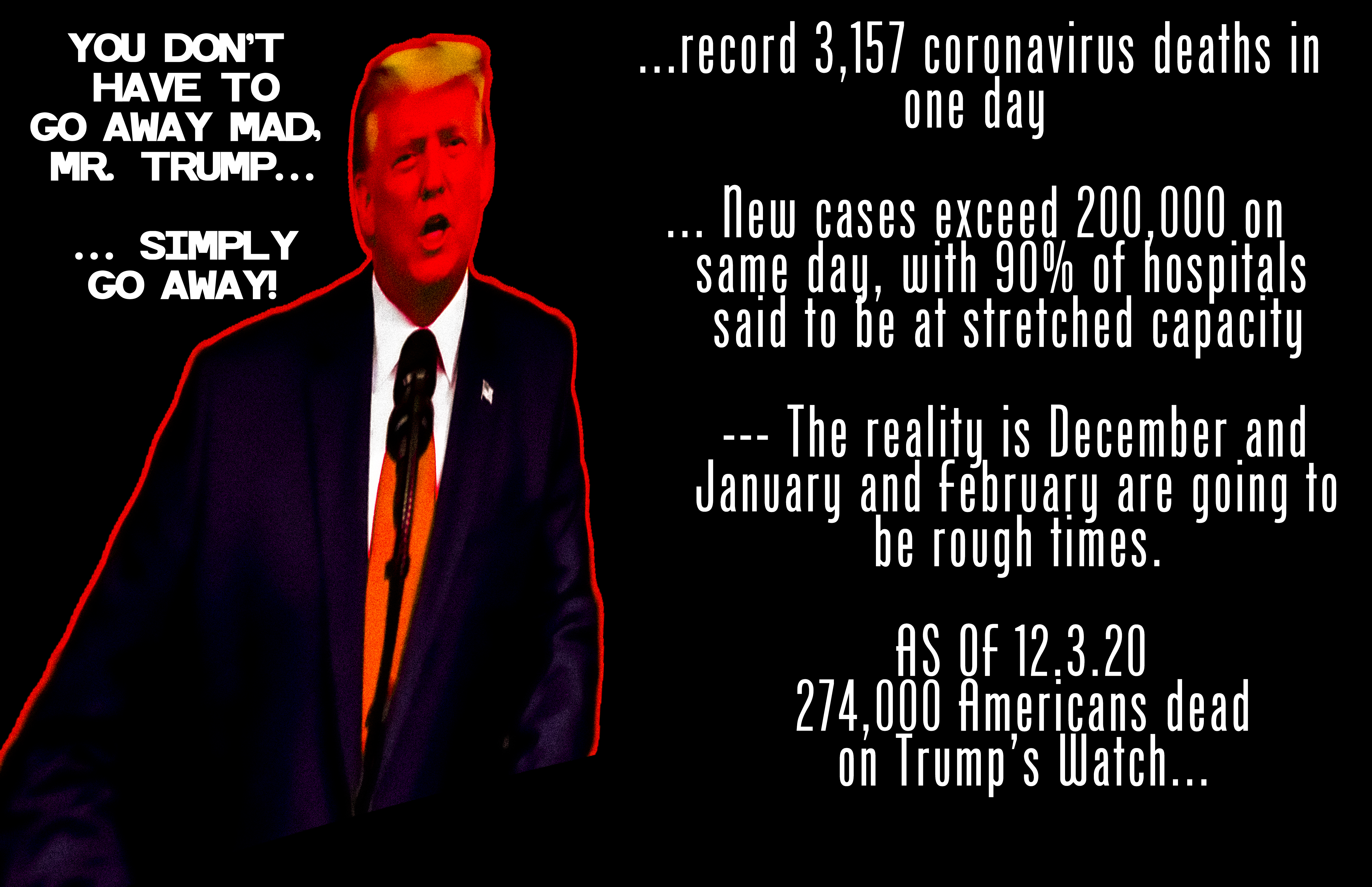
The Guardian-US logs a record 3,157 coronavirus deaths in one day
The headline above was from the Guardian yesterday… that headline has now changed from the number in the headline above to 2,802 (msnbc) or 2,804 on the Guardian, the number has now been corrected on the Guardian.
These maps show how your state is doing.
At the state level, things can look even worse than the national picture.
Public health experts look at a few markers to determine how bad things are in each state: the number of daily new cases; the infection rate, which can show how likely the virus is to spread; and the percentage of tests that come back positive, which should be low in a state with sufficient testing.